Typographic Grid Design
A simple way to organize text and elements on a page — applied to a tropical travel agency catalog.
Structure as a design tool
The typographic grid is one of the most powerful and underrated concepts in visual design — a simple way to organize text and elements on a page so that everything feels intentional and in harmony.
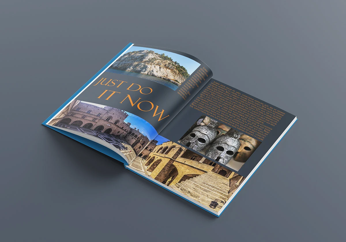
This project applied grid-based thinking to a travel agency catalog, exploring how consistent column structures, baseline grids, and a clear type hierarchy can carry a brand identity across both print and digital formats.
The tropical travel theme served as the perfect canvas: rich imagery, bold headlines, and layered information — all demanding a robust layout system to hold together without visual chaos.
Building a scalable grid system across print and digital
Travel catalogs live in two worlds simultaneously — printed brochures that land on coffee tables and digital PDFs shared on screens. The challenge was designing a single grid system flexible enough to scale gracefully between A4 print sheets and responsive digital layouts, while keeping typographic hierarchy legible, the tropical photography center-stage, and the overall system reproducible by a small design team under deadline pressure.
Four phases to a coherent system
Research — Grid Systems & Editorial Design
Studied classic typographic grid theory (Josef Müller-Brockmann, Swiss style) and modern editorial layouts from travel magazines. Audited 12 competitor catalogs to map what works and where layouts collapse under information density.
Grid Setup — Columns, Gutters & Margins
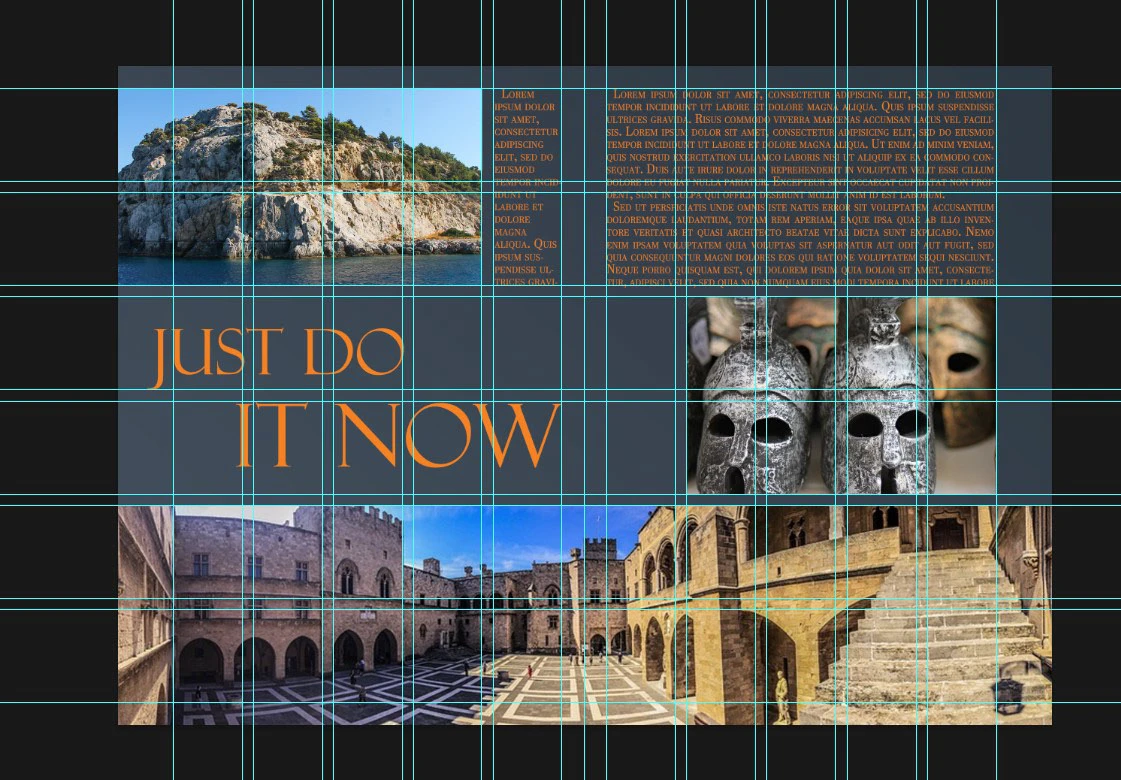
Defined a 6-column grid with 8px gutters and 24px outer margins, mirroring InDesign's default document grid. Tested the structure across A4 (210×297mm) and standard digital screen proportions, confirming stable column widths at both resolutions.
Typography Scale — Hierarchy & Rhythm
Built a modular type scale based on a 1.618 (golden ratio) multiplier: 12px caption, 16px body, 20px lead, 26px subhead, 42px display. Set leading at 1.6× for body text to create a visible baseline grid, with tight letter-spacing on uppercase labels and loose tracking on serif display sizes.
Application — Travel Catalog Pages
Applied the grid to 8 catalog page layouts: cover spread, destination overview, itinerary detail, pricing table, photo essay, and back cover. Each layout was constrained to the same grid, demonstrating how a single system produces visual variety without losing consistency.
Six principles that drive the system
Column Grid
A 6-column structure provides maximum layout flexibility — elements can span 1, 2, 3, or 6 columns, enabling both narrow sidebars and full-bleed image treatments.
Baseline Grid
All text elements lock to an 8px baseline grid, creating vertical rhythm that makes the page feel composed even when mixing multiple type sizes on the same spread.
Golden Ratio
The 1:1.618 ratio governs both the type scale and image proportions, connecting headline sizes to body text and image crop dimensions to page margins.
Type Hierarchy
Five distinct typographic levels (Display, H1, H2, Body, Caption) each with unique size, weight, and tracking values, ensuring that any reader can navigate content at a glance.
Scalability
The grid adapts across media — the same column ratios that work on A4 print translate cleanly to 1440px desktop, 768px tablet, and 375px mobile screen widths.
Tropical Aesthetic
Warm amber and teal color palette, serif editorial typefaces, and generous white space create the unhurried feel of a premium travel brand — reinforced by the grid's consistent rhythm.